
01 / Project overview
Ameniti tell our stories and bring our collections to life through original prints, luxury fabrics and artistic embellishments. Every print used in our clothing is photographed by our team. The typical user is between 19-30 years old, and most users are college students or early career professionals. Our goal is to make shopping fun, creative, and easy for all types of users.
02 / About Us
Ameniti is not just another fashion brand, it's a progressive clothing line with a style statement that oozes boldness in its designs, style and colors. Ameniti is all about creating a tribe of men and women who are unworried and untroubled by the world around them. People who are vivid not just inside but ready to express it to the timid world outside.
03 / Design Process

04 / PROBLEM
Customers return an estimated 40% of what they buy online, mostly because of sizing, style and fit. Most of them use fit predictors, size charts and still over a third regularly buy more than one size/style of the same item.Customers enjoy the ease of ordering clothes online from the comfort of their homes, but the frustration and the fear of getting deceived by the final styleand look deter shoppers from exploring various styles and reduces the retailer’s revenue due to high return rates.
05 / GOALS
My solution statements to the challenges addressed above till now were:To provide all-in-one fashion information in one place. To give a satisfying readability experience with customizable content. To elaborate luxury products as precisely as possible to the users.And most importantly, to provide a feeling of worthiness and importance to the users and to build a self-confidence among them with the help of improving their lifestyle and sense of fashion
06 / USER RESEARCH
Because Design Thinking emphasizes the importance of human-centered design, the first step of the process is to empathize. This essentially gave me the opportunity to gain some insight into the thoughts, feelings, and needs of the users.User InterviewsI conducted interviews with users who are familiar with online shopping to identify their needs and pain points. Because a wide range of demographics enjoys online shopping, I interviewed a total of four participants between the ages of 18 and 50.
Two out of four participants discussed the need for more reliable size guides due to different body shapes. Three out of four participants expressed their frustration over the fact that the product might not fit them as well as they do on the model.Three out of four participants noted that customer reviews of the products are helpfulThree out of four participants stated the importance of knowing the quality of the productAll of the participants discussed the need for some kind of filters when shopping onlineTwo out of four participants were motivated to find and buy clothes in a timely manner
Pain Points

Navigation
Shopping website designs are
often busy, which results in
confusing navigation

Interaction
Small buttons on shopping
websites make item selection
difficult, which sometimes leads
users to make mistakes

Experience
Online shopping websites don t
provide an engaging browsing
experience
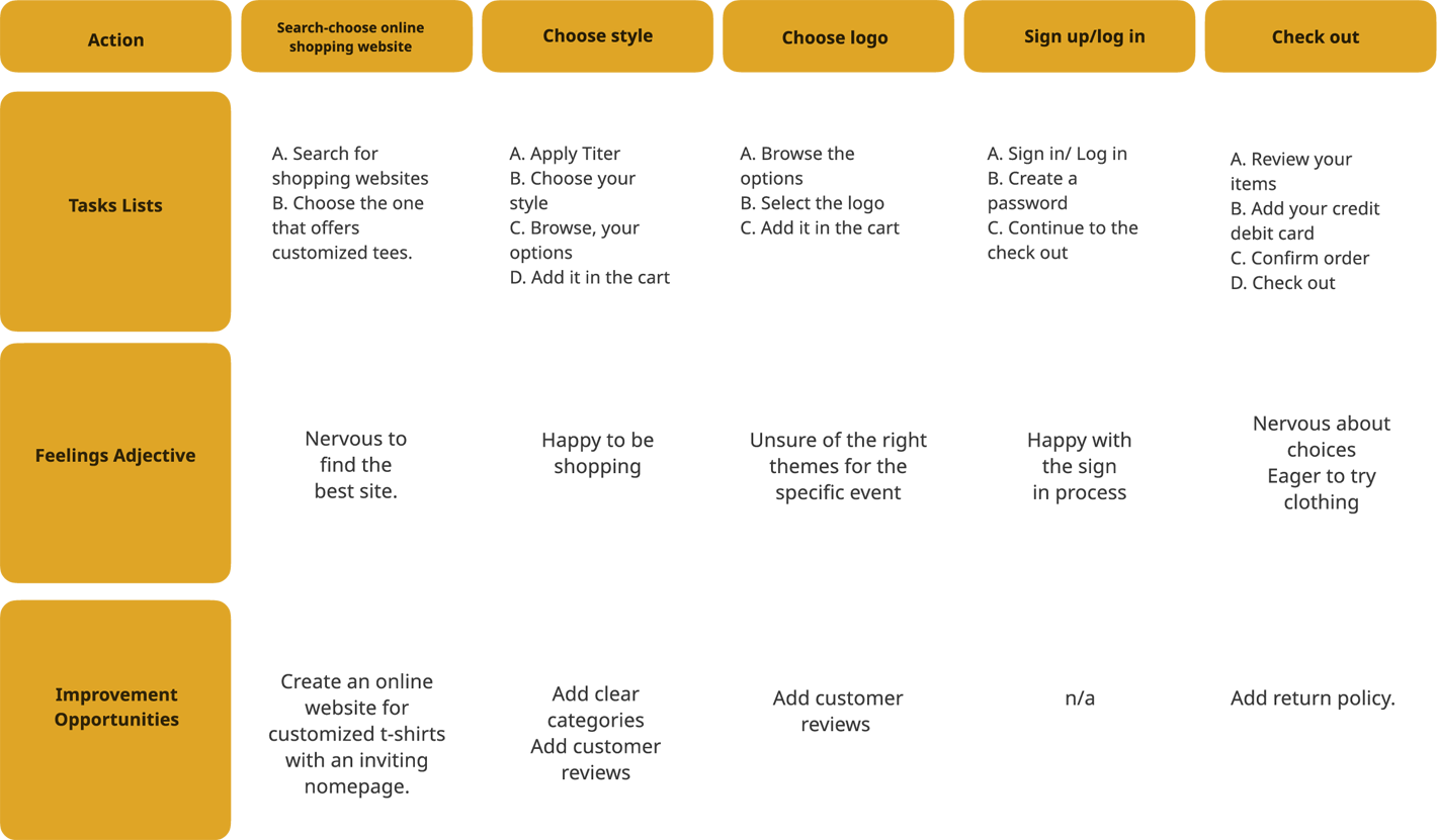
06 / Journey map
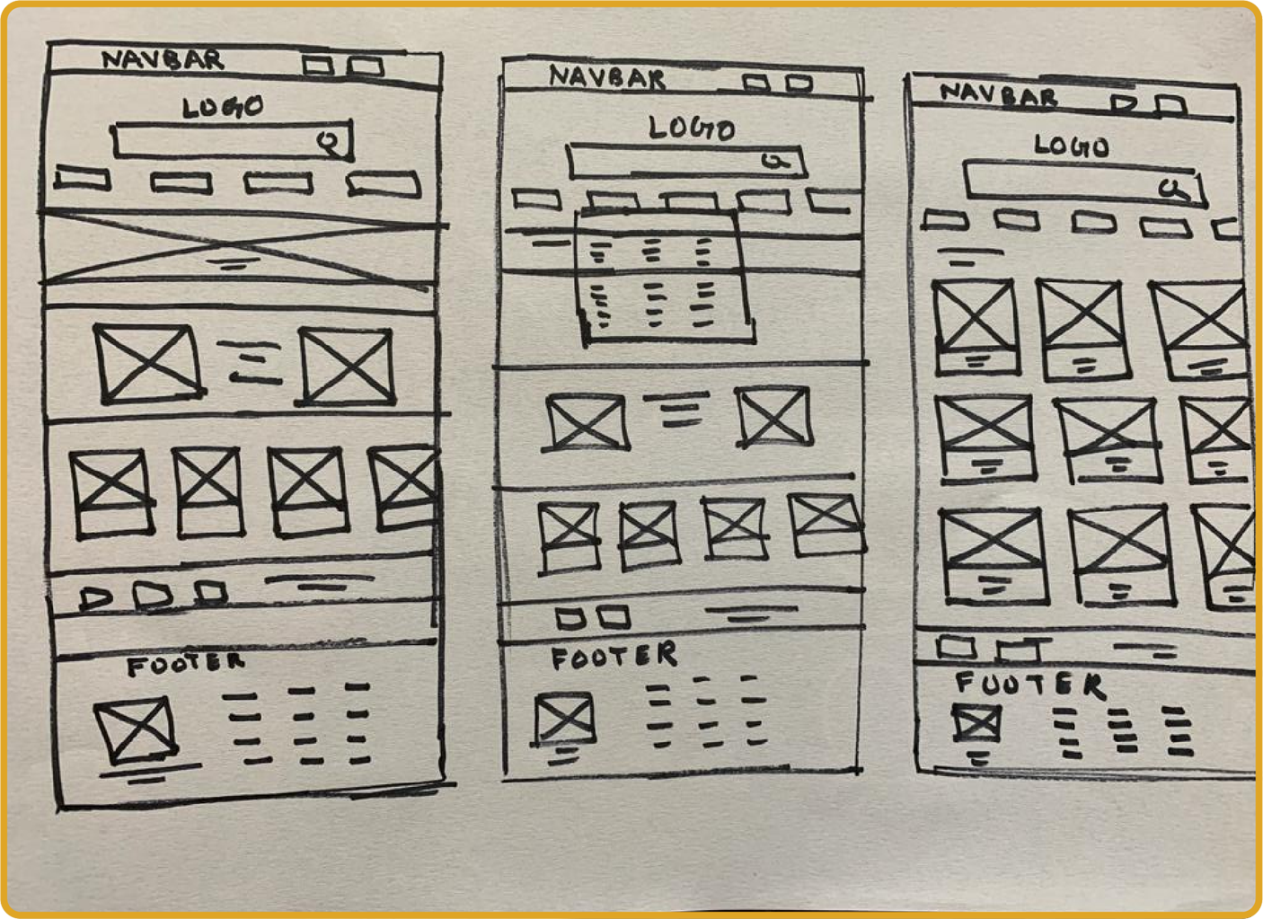
07 / PAPER SKETCHES
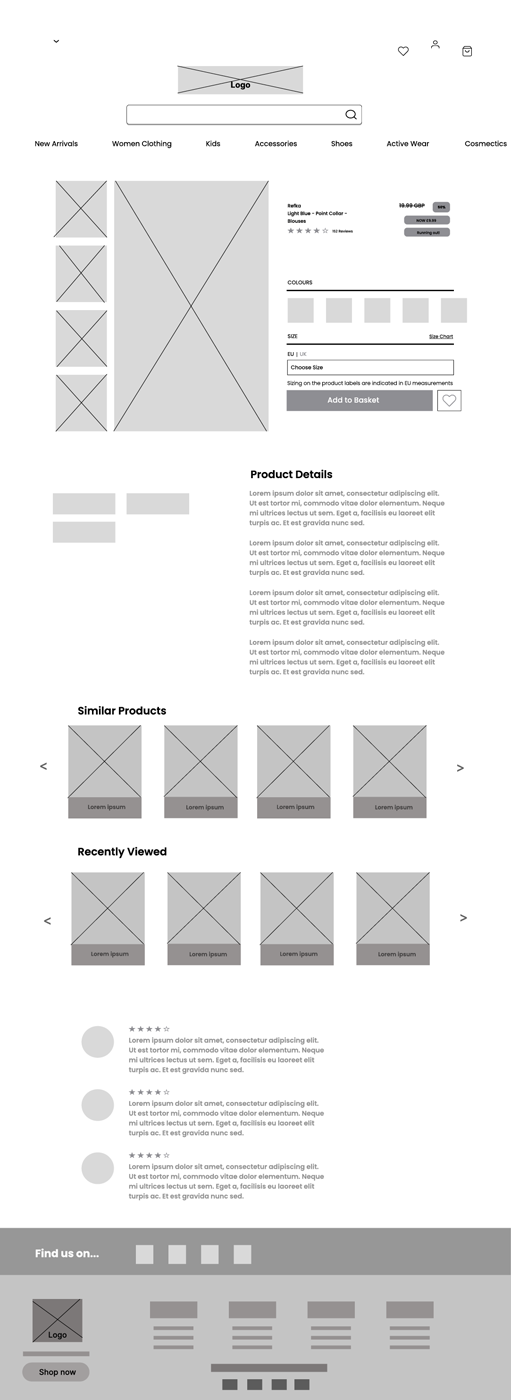
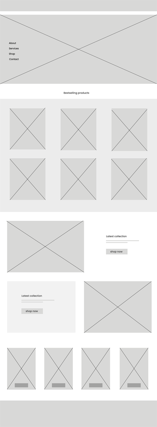
06 / Digital Wireframes
Moving from paper to digital wireframes made it easy to understand how the redesign could help address user pain points and improve the user experience.
10 / USABILITY TEST
Details
Findings
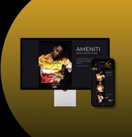
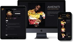
11 / high-fidelity designs
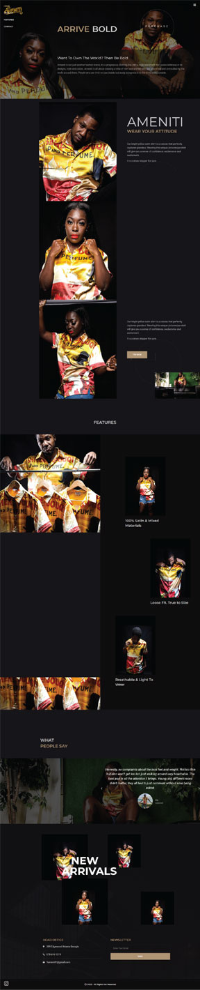
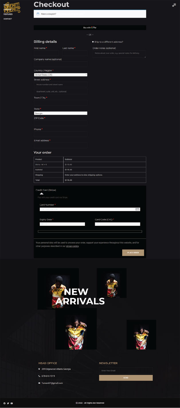
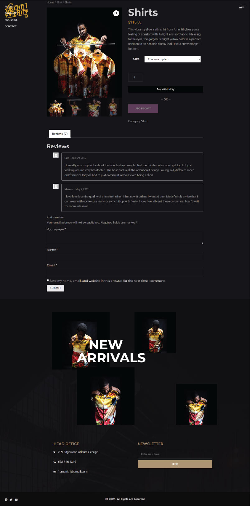
12 / MOCKUPS
13 / Website Link
14 / TAKEAWAYS
Our target users shared that the design was intuitive to navigate through, more engaging with the images, and demonstrated a clear visual hierarchy. I learned that even a small design change can have a huge impact on the user experience. The most important takeaway for me is to always focus on the real needs of the user when coming up with design ideas and solutions. Conduct follow up usability testing on the new website. Identify any additional areas of need and ideate on new features.